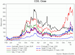
I love this chart . . .
it shows historical Credit Default Swap spread charts since the beginning of the financial crisis – a gauge of how close a nation is to not being able to finance its debt. As per a point I made in my recent piece in the Wall Street Journal I think these charts show clearly that Ireland’s commitment to reducing public expenditure a year ago has paid dividends in reducing CDS spreads by 150 points, whereas Greece which started at the same level, has gone some way in the other direction. In light of this success – much more pronounced with 5 year bonds (as shown in this chart) perhaps there’s scope for less of an argument being made for the UK following what Canada and Sweden did 15 years ago, and much more of a case for what’s happening in default-defying, tangible real time, just across the Irish Sea?
Meanwhile, thankfully, the UK is not in that much danger of default with a “mere” 90 bp spread. This is still expensive debt servicing at £30 bn plus a year. But it’s a long way from default. Then factor in some other points in the UK’s favour against the likes of Greece;
i) We have a lower base rate 0.5% v. 1% in Euroland
ii) Government debt is much longer term maturity than anywhere else – about 14 years, so no imminent rollover crisis
iii) That government debt is not held largely by foreign creditors – although no one knows precisely by country of origin, but it seems that Insurance Companies, Pension Funds and the Bank of England play a hugely bigger role than foreign investors in the gilts market compared to say Chinese and Japanese owners of T-bills in the USA or German investors in Greek bonds.
iv) The value of the pound has fallen around 25% giving us plenty of upside potential come the recovery. Ok, so it hasn’t happened yet, but who seriously wants to go into a recession and come out of a recovery with a strong currency?


[…] has been 6 months since I showed in chart form here, the credit default swap spreads over 5 years for Germany, the UK and the PIIGS. Then I was arguing […]